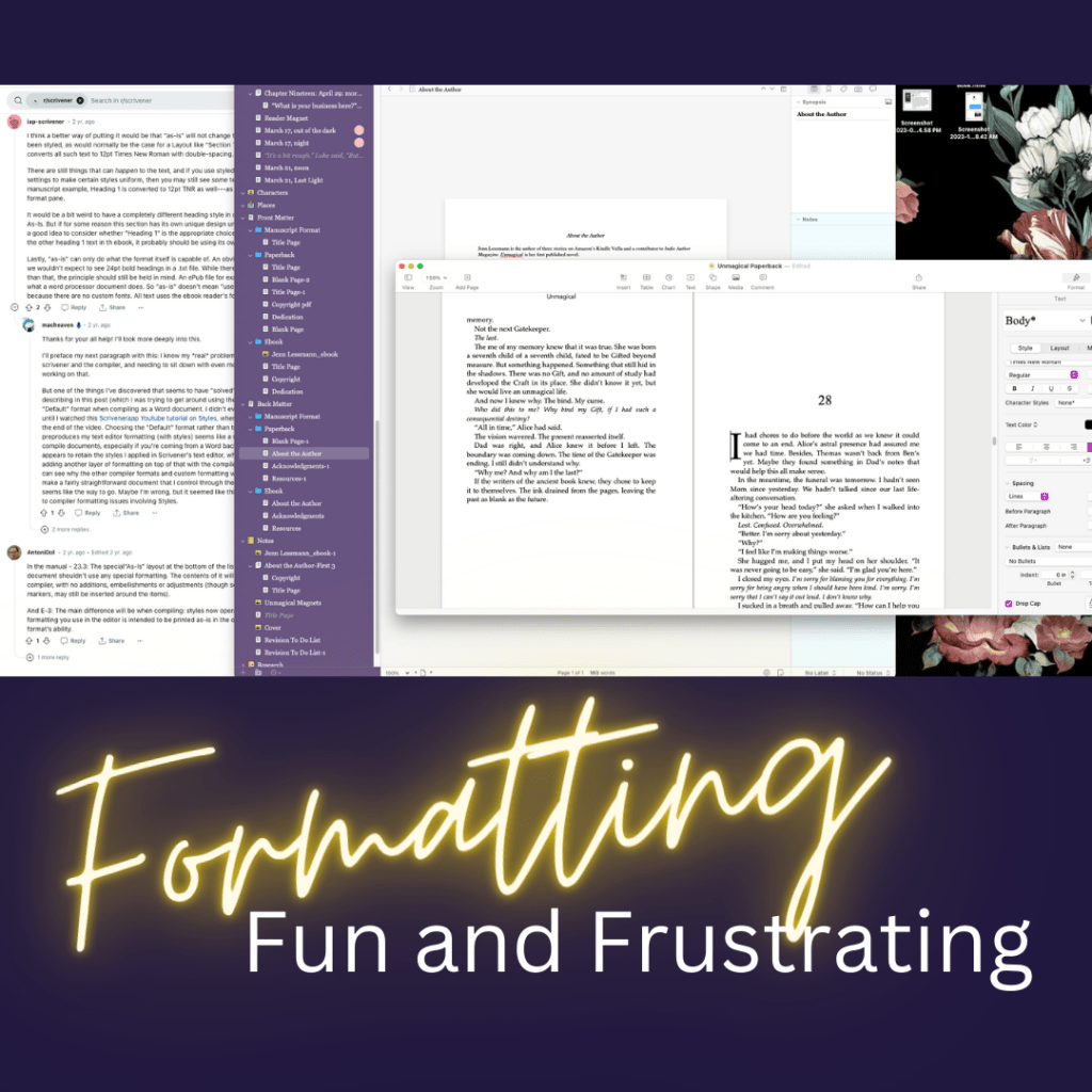
I’m using Scrivener for revisions and editing, and I used it to compile the epubs for my ARCs.
It’s been going pretty well, although it took about a week of watching YouTube videos and Scrivener tutorials to figure out how to add images to the manuscript.
I’m reasonably happy with how the ebook looks now, so I’ve moved on to the print file.
And that’s where it all went horribly wrong. J/K. But seriously, compile for pdf is way more problematic than compile for epub.
What I Want: The copyright page to have much smaller font size than the rest of the book, and the back matter to have slightly different formatting than the rest of the book.
What Scrivener tells you to do: Choose “As-is” for the section layout for the front and back matter, so it theoretically compiles with whatever formatting you set up in the editor.
What happens: Every time I do this, it changes the fonts back to match the rest of the book. Neither I, nor the Help Desk, can figure out why.
What I tried instead: I moved the copyright page into Canva and set it up as an image that I inserted into the doc.
It didn’t work. Scrivener cut off the side of the image (although it doesn’t do that to any of the other images in the book).
So, I gave up compiling for print or pdf and compiled for Word, even though I don’t have Word.
Low and behold! When I open the Word doc in Pages, everything looks great!
And Pages has a checkbox to add drop caps! I love drop caps!
I was also able to fix some formatting issues Scrivener was having with my scene break images.
And then I exported it to pdf, and nothing went wonky, so I think we have a winning combo for formatting when I’m ready to release the paperback! yay!

Leave a comment